If you’ve been tempted to back Critit’s latest dice Trinkets, Knick-naks and Do-dahs Dice Kickstarter but are still on the fence because you’re not sure whether the dice will hold up to the product photos, this might just be the post for you.
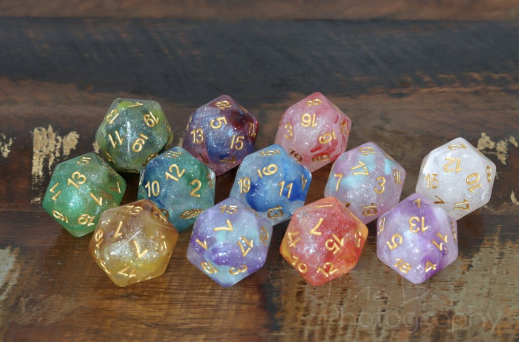
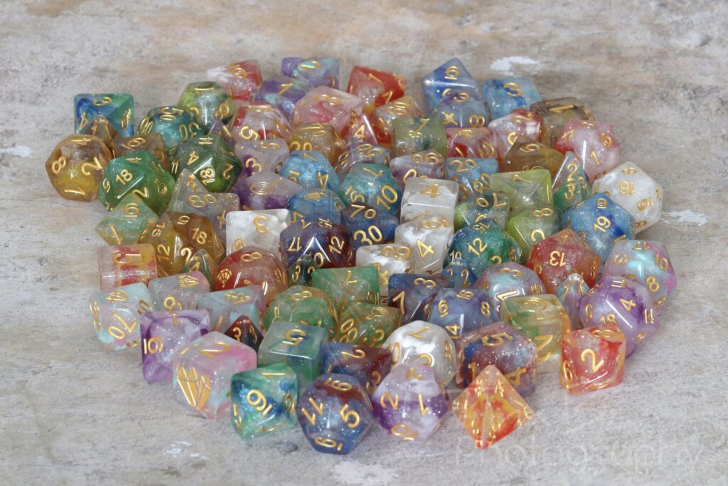
Critit asked me if I would want to take photos of their Kickstarter dice, so here’s the 12 sets that are currently offered, photographed with my DSLR and macro lens in normal interior daylight conditions. In my photos I try to depict the dice as naturally as I can without amping up the saturation or contrast, so hopefully these are indicative of how the dice look in real life.

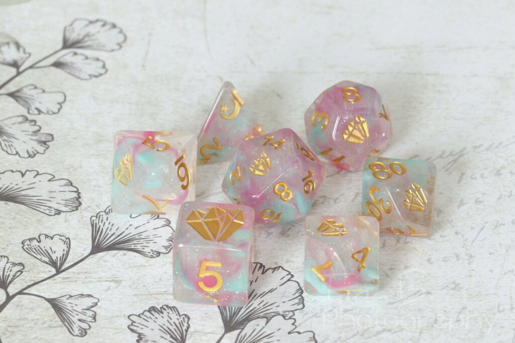
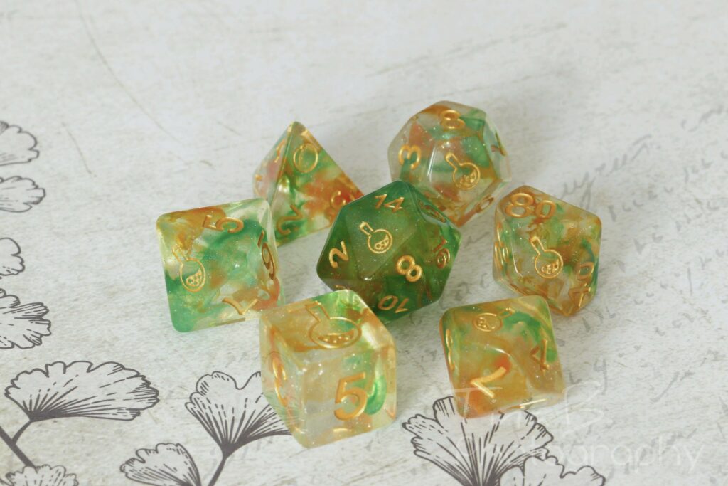
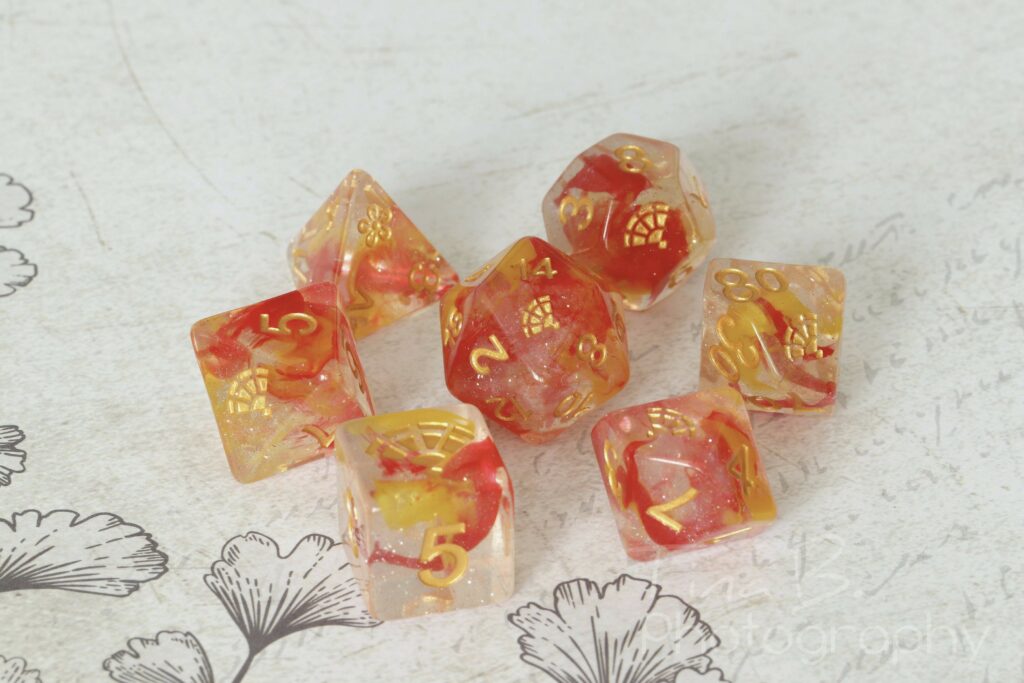
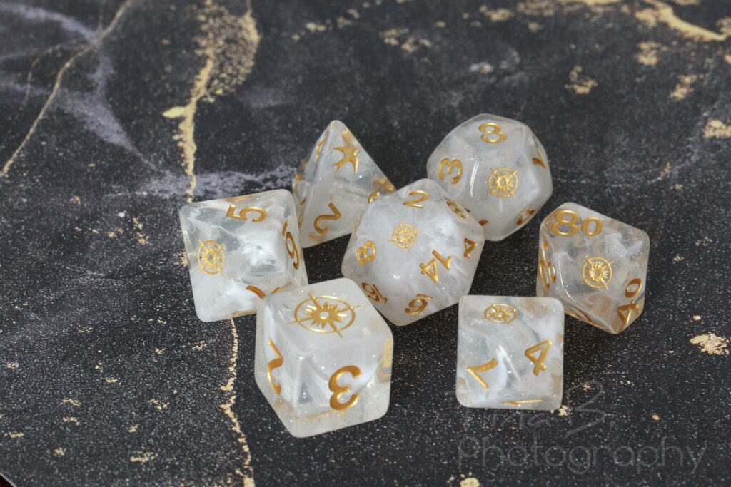
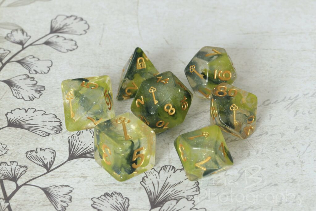
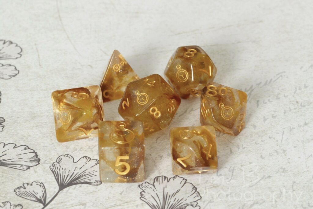

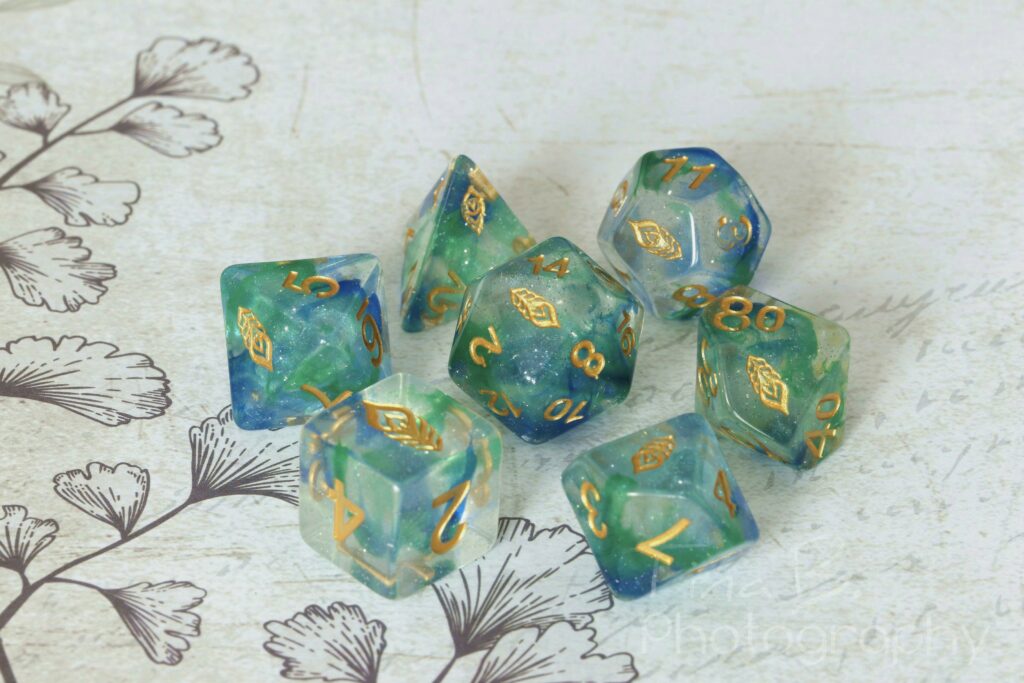
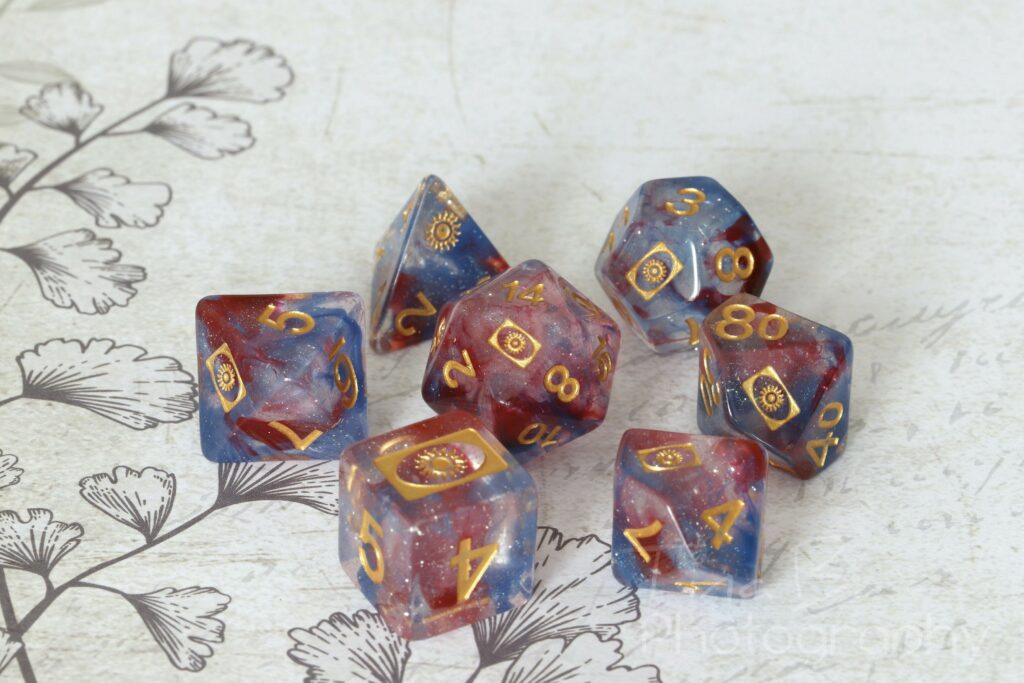
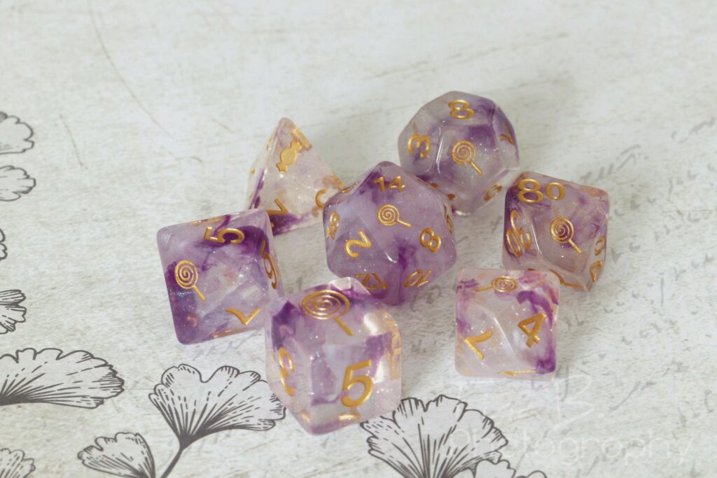

As for the dice themselves, the design of these is very similar to existing HD Luminous sets, although some of them have new colour combinations. All dice have logos of a particular trinket on the face of the highest number. The d4s have a logo that replaces one of the three 4s but it’s not the same logo as on the other dice, yet one that fits with the theme of the set (e.g. a teacup rather than a teapot or a lock rather than a key).
Visually and quality-wise, these are on par with existing resin sets from the HD Luminous line or similar releases (e.g. the FanRoll Unicorn Dice). They all have gold ink, which is perhaps not the best choice for some of the sets because it makes them harder to read than they should be.
The dice in hand are not quite as vibrant as they may appear in the Kickstarter photos and are a bit more muted in comparison. With the exception of the Compass set, the dice are all clear resin with swirls in two different colours (the Compass set is clear with only white swirls). The colours are rich without being overly vivid, the swirls are distinct and noticeable, they have a good distribution of both colours in the sample sets I have. The glitter is a fine silver that shimmers subtly blue from certain angles. Overall, I think they look really nice.
That said, those who know me well will be aware that I’m not a huge fan of logos on dice, so I will say that these didn’t personally wow me. The Luminous design has been around for a good number of years, so these aren’t anything groundbreakingly new in terms of how they look.
Their main selling point are the logos, so I feel they might appeal most to people who don’t have any dice yet in the Luminous line or like certain colour combinations, or people who like the logos and the theme behind them, perhaps those who have a certain RPG character who has a connection to these themes.
If you’ve been undecided whether or not to back the Kickstarter, perhaps this might help you make a decision. It will run until July 3.
If you feel this would be helpful for people in other dice or RPG communities, feel free to share the link to this blog post.
As a disclaimer, I am not associated with Critit in any way, nor do I have any stakes in the Kickstarter or the company whatsoever. I received the dice as free samples but did not receive any monetary payment or other incentives.

